Google Sites receives a interface update in much the same style as the other Google Apps. This interface, like the others I'm sure, will catch you off guard - your classic icons will be replaced with sleeker, gray icons (The gray trend in web design seems to keep on growing.)
Here at
Kirksville Web Design, we instantly could not resist hitting the "Try our new look" button and delving into a redesigned world of Google Sites. It's more contemporary in look and feel, but there's not effect on the content. If you can't seem to find how to implement the new look, go to:
What does this teach us about web design in general?
- It is important to keep your websites fresh. I have been bumping into too many websites from the 1990's. Reach out to these folks and tell them that they can have a contemporary website, with a contemporary interface.
- Incorporate the new cool tones in web design. Gray, Dark Gray, White, then hit it off with an eye-catching accent. Throw a hot orange or teal in the mix. Neutrals and a monotone. Webcreme is crawling with examples - check them out.
- Well designed icons, explore the free Plastique icon set of 400+ old fashioned, but cool gray icons.
- What did you learn and what did you like about the new Google Sites look?
 |
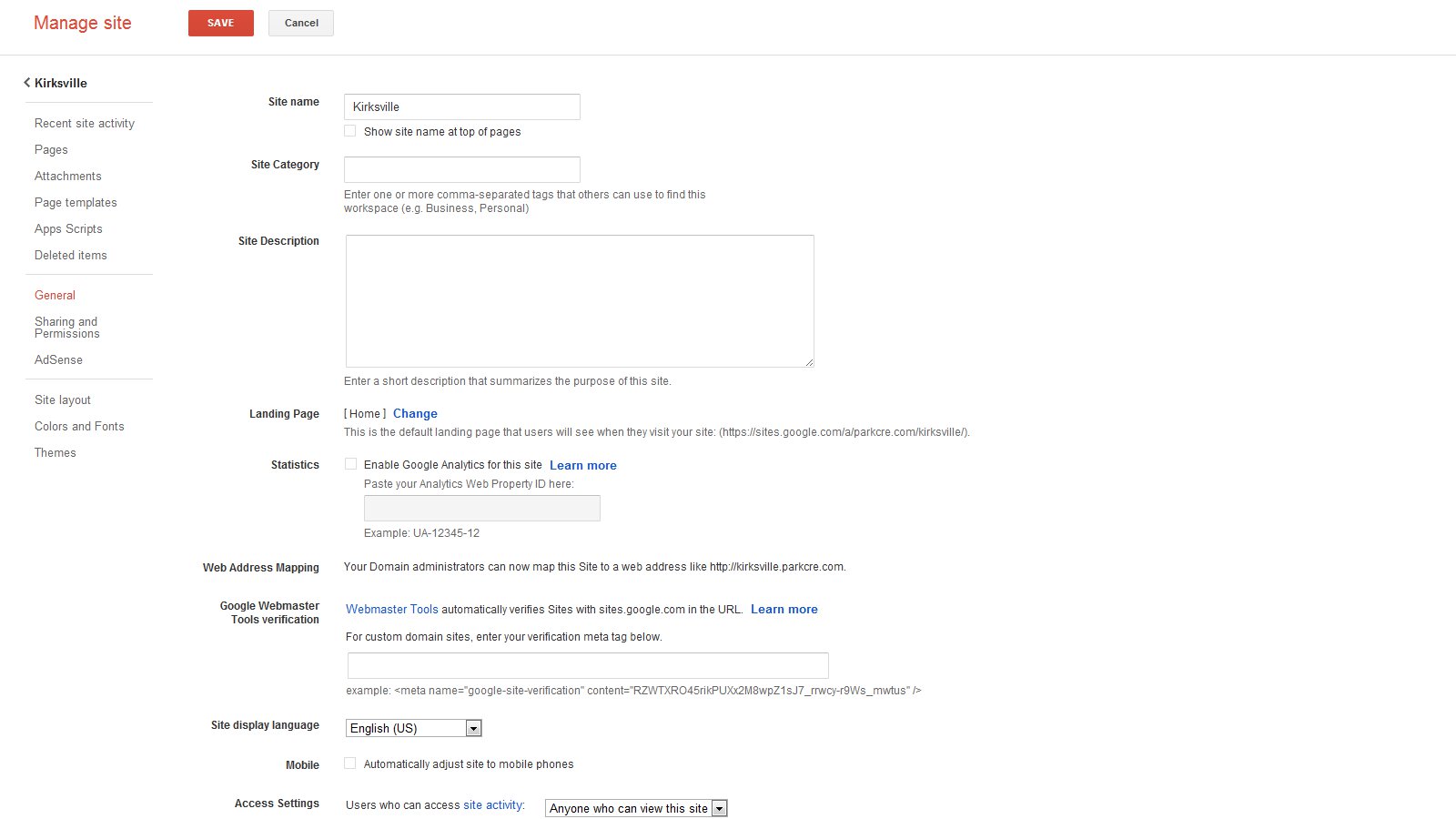
| Boxy interface, Gray, White, and RED accent |
 |
| Beautiful Icons, Find a set that fits your needs too |


You can know the way to get Google sites interface to overhaul it. The information is very useful
ReplyDelete